A little less than 8 years ago when this little blog called The Monsoon Diaries was first being developed, a concept of a backpacker with his pet llama was put together as our temporary logo by my college friend Brian Foo as he was designing the first version of our site:
 The title “The Monsoon Diaries” was initially presented in a simple, standard Times New Roman font. After all, none of us knew what this was going to be at the time. All I wanted was a blog that felt homey, where you could curl up reading with a cup of tea on a rainy Sunday morning as raindrops tap tap tap with their kamikaze runs on your windowpane.
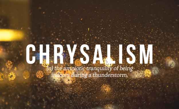
There’s an actual word to describe this feeling — chrysalism: the amniotic tranquility of being indoors during a thunderstorm, listening to waves of rain pattering against the roof like an argument upstairs, whose muffled words are unintelligible but whose crackling release of built-up tension you understand perfectly.
And thus in May of 2010 we rolled out a website:
But as I traveled, the website grew, and a community of self-proclaimed “monsooners” began to create itself, my desire to forge a unique identity emerged. I delved into introspection and realized my romanticism with travel was best encapsulated by certain stories that all had one thing in common: they were rife with a combination of adventure and melancholy. Even my first time backpacking alone would involve a complex intersection of both emotions.
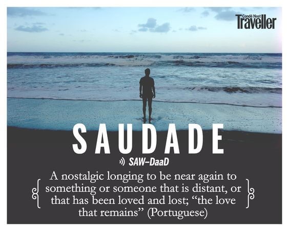
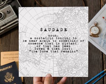
And if I were able to pick a sentiment to put this together, it would be saudade: a feeling of longing, melancholy, or nostalgia that is supposedly characteristic of the Portuguese or Brazilian temperament. . . . the recollection of feelings, experiences, places, or events that once brought excitement, pleasure, well-being, which now triggers the senses and makes one live again . . . It brings sad and happy feelings altogether, sadness for missing and happiness for having experienced the feeling.
Apparently I’m not the only one who feels this way about travel:

But if pictures are worth a thousand of these words and if I could choose an image that would best evoke saudade and chrysalism, it would be a poster of Lost In Translation (which also happens to be one of my favorite movies related to travel) — Scarlett Johansson looks past the hustle of an unfamiliar Tokyo, among which she contemplates an otherwise peaceful yet melancholic moment under a clear umbrella recently painted with fresh raindrops:
![]()
It is the minor detail of a clear umbrella, those raindrops, the noisy lights around her, and her calm, serene facial expression which evokes those very same rainy Sunday mornings I just aforementioned. Can we experience such a feeling when we travel? Absolutely, because it happens all the time. Moreover, the very story in Lost In Translation has already happened to me, not once, but twice.
But more to the point: can I encapsulate this feeling in a logo?
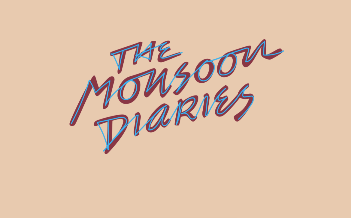
 So in 2012 the lazy side of me believed I just needed to choose a font to fit the temperament I was looking for. At first it was my instant attraction to the Dakota-Handwriting that would lead to the next version of a logo:
But alas, I was using Dakota Handwriting, a premade font that still wouldn’t achieve the goal of making any brand unique. People were easily recognizing it as Dakota Handwriting, which made me feel like I might have as well used the Papyrus font instead:

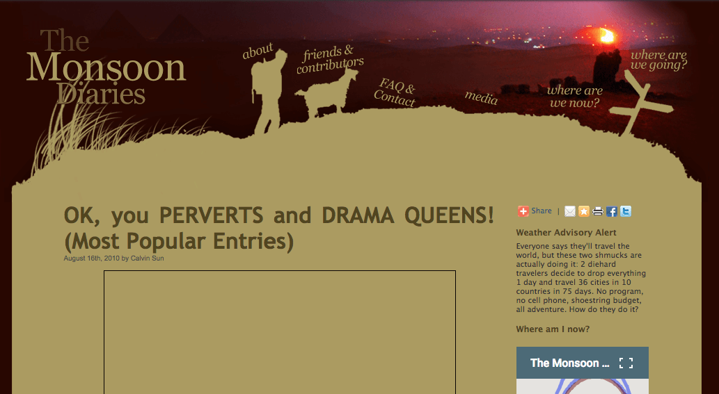
In 2016 my high school friend Lei Zhao graciously offered his help to redevelop the website into the beautiful, more efficient and cleaner version that we have today, all while keeping the Dakota – Handwriting motif. When things then took off in 2017 after my interview with 20/20 on ABC News and I was invited more and more to speak at events around the country about The Monsoon Diaries, I finally accepted that I needed a revision. I needed something unique.
Not learning from my Dakota – Handwriting font foray, however, I went back at it alone with comical effect:
As if trying to skate uphill, I instead was drowning in my own inadequacy. So my partner stepped in and thankfully referred me to her college buddy Eric Doctor who specializes in typography and graphic design. Sometimes, you just need an intervention.
When we met, Eric’s enthusiasm to develop the logo from the bottom up — organically, if you will — eased my concerns giving up the control of my branding to someone I had just met. But I would make the mistake of suggesting that I primarily wanted a logo that would better promote our trips and the “travel company business” side of The Monsoon Diaries. I made no mention of saudade, chrysalism, or anything that have made travel so personal to me. I thought I was being practical at the time, but really I really wasn’t being forthright enough with Eric of why I travel.
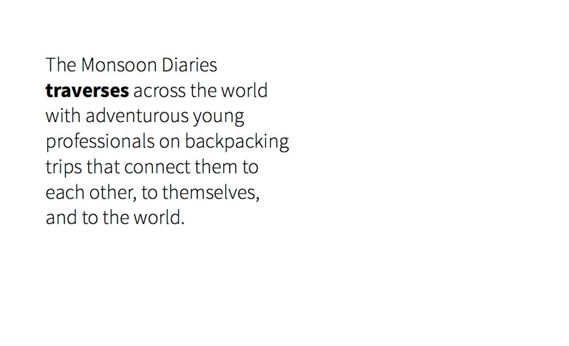
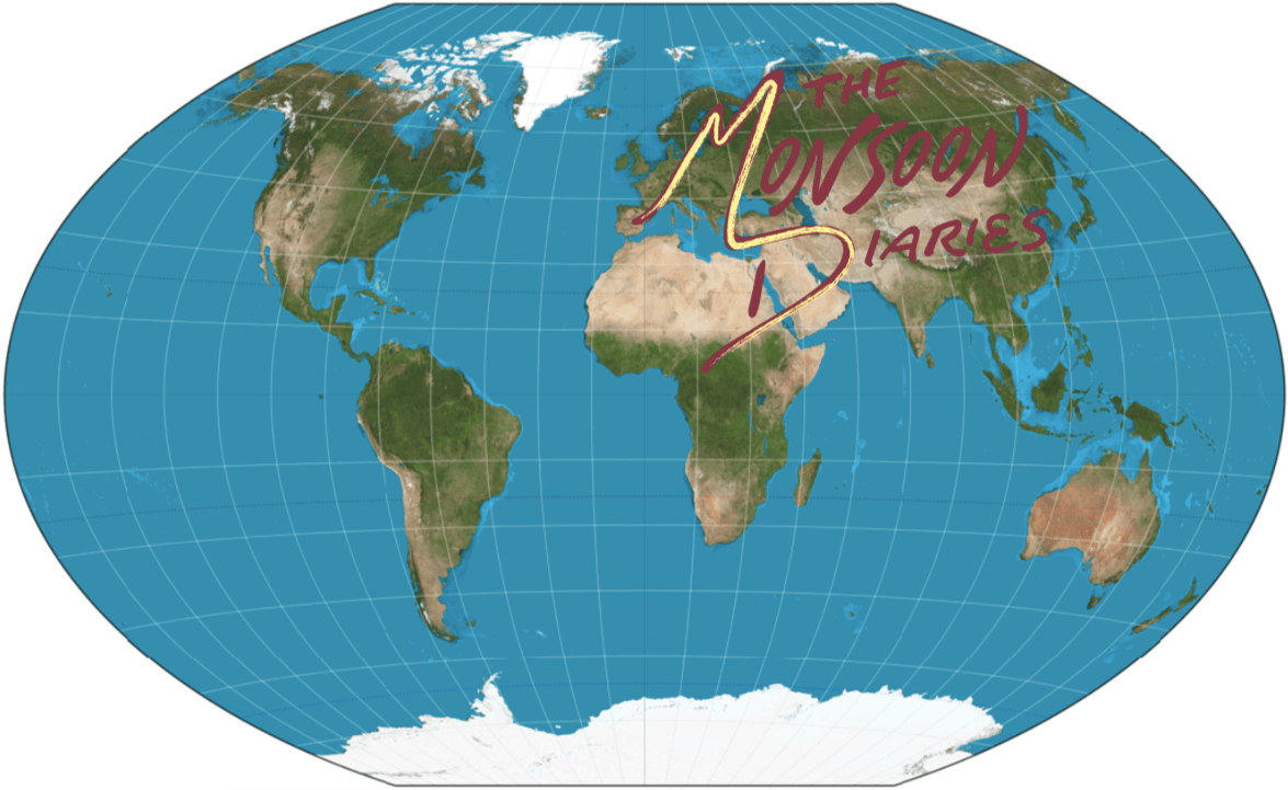
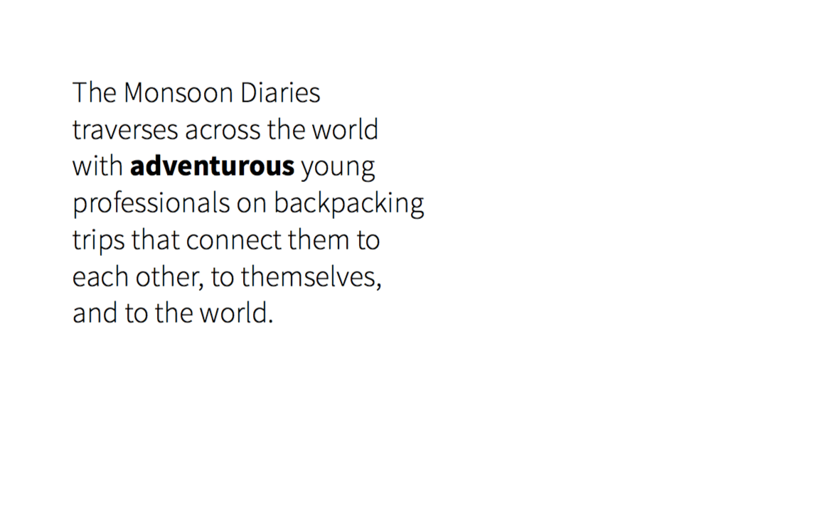
Nevertheless Eric did a terrific job — he first focused on the word traverse, and sketched randomly on a map a sample itinerary:
He next focused on the weather pattern of a monsoon, and made an illustrative font out of that:
Another concept was the idea of human connections we formed on our travels:
Finally was his focus on “Diaries” instead of “Monsoon”:
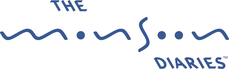
I was initially drawn to his first 2, so we decided to combine the two concepts:

I then asked him to lean a little towards the 1st attempt more:
![]()
And it was at this point — about 4-5 months into the process — where I began to feel something off. Although my gut reaction was that this latest logo would work and it achieved a healthy balance of all his iterations, I began to feel uneasy when I realized that my attempt to find a logo that evoked “adventure” and “come to our amazing trips” would make our brand too “cartoony.” This current logo felt like we were promoting a new rock band. Something in me yearned for something more honest.
So I bit the bullet and asked Eric for the hard thing: a reset. We sat back down and this time I told how I truly felt about travel. I explicitly waxed poetic about chrysalism and saudade. I showed him the photo of Scarlett Johansson from Lost In Translation. It needed to evoke an emotion I even had a hard time describing.
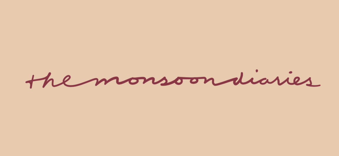
Eric knew I wanted a logo that would make me fall in love at first sight. And thankfully he joined me in the idiosyncratic proclivity for melancholy and nostalgia when it came to adventure travel. He once again started from scratch, contemplating the words chrysalism and saudade as he sketched a simple concept:
I like to believe that Eric also would subconsciously notice my frequent use of ellipsis in some of my favorite throwback posts.
I also loved the idea that we were now flirting with a wave-particle duality motif from quantum physics. After all, our trips have always been paradoxes — to be in perpetual motion while also stopping for an eternity moment so we can reflect on this crazy world around us. And just like a monsoon we appear as quickly as we disappear, leaving an impact with a minimal footprint. And if that doesn’t work for you, we’re also group travel for people who hate group travel.
The sketch soon became a concept. And a few months later when I first laid eyes on the new product, something inside me stirred.
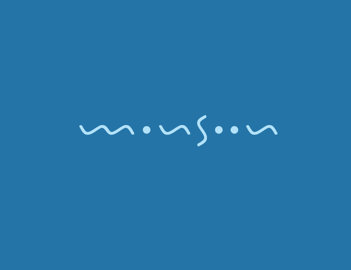
It was a feeling I’ve been looking for.
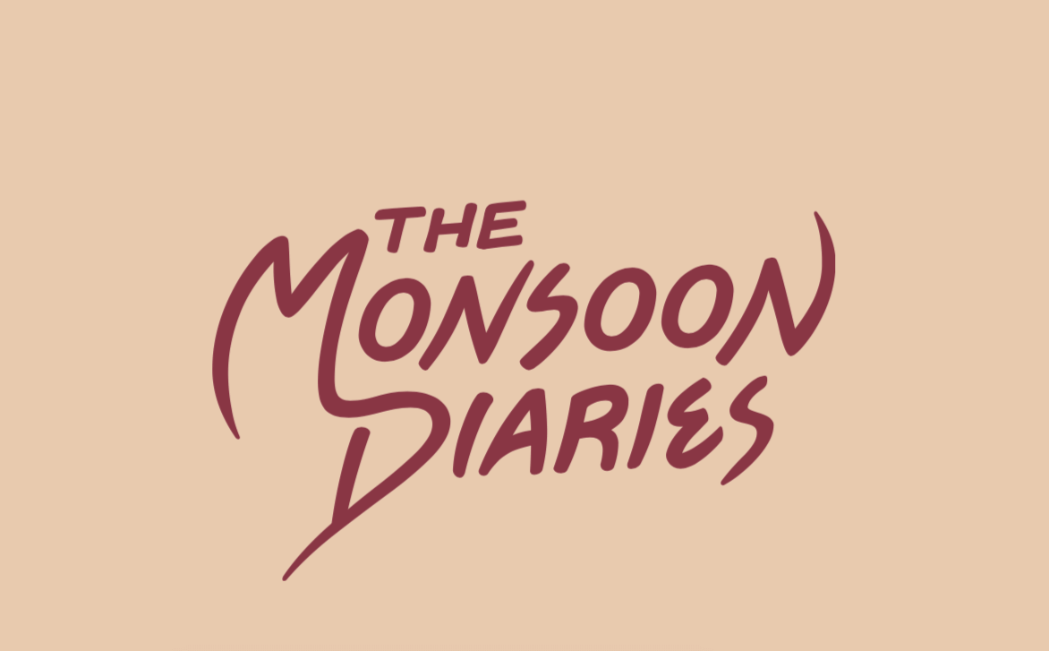
And after 8 months of working on this, we just had to make it perfect; I had to be sure I wasn’t missing anything else. So we went through various versions over initial concerns of legibility.
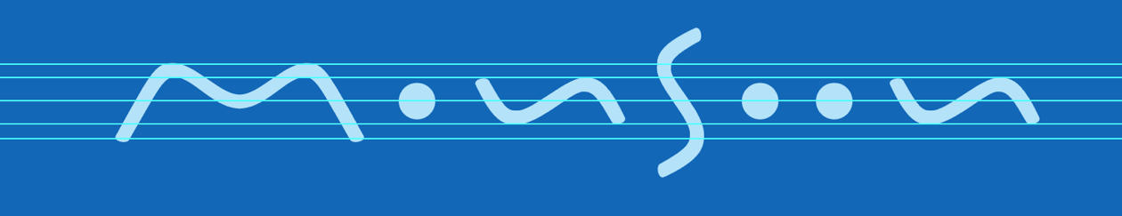


But alas, some parameters made these alternative versions feel off:
And I still preferred the balance of the former:
So I asked to shave off the end of the “m” of the primary version to make it more legible.
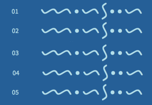
My favorite number was 3 anyway.
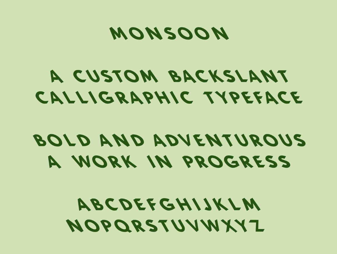
As all this was happening, we realized a dreamy-like concept for the word “monsoon” based on ideas such as saudade and chrysalism would need a font that was more grounded to balance things out. So if you take a typographist like Eric, he would not be satisfied with anything less than to design an entirely new font from scratch: It would be called monsoon.
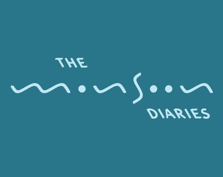
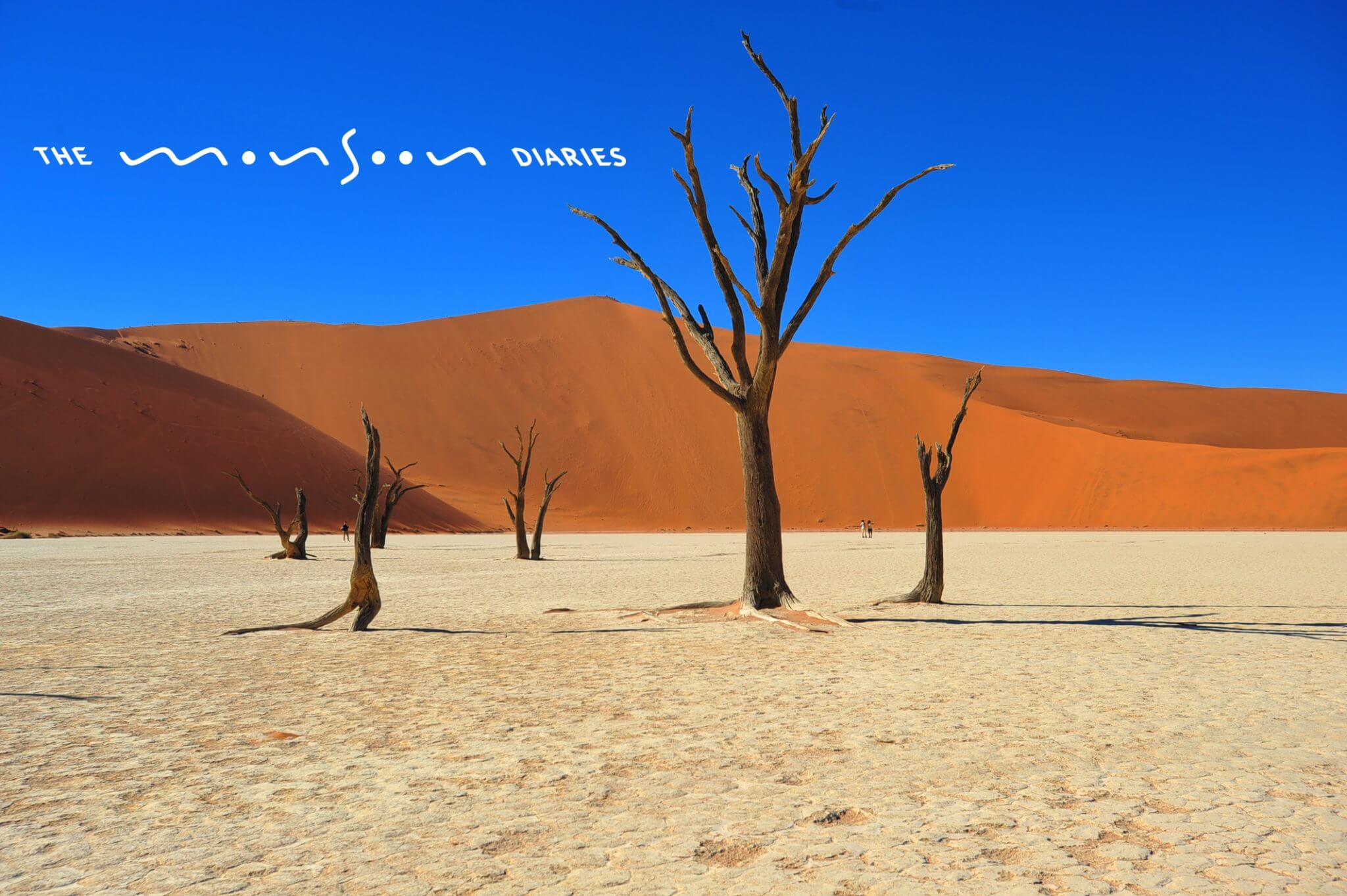
And when we combined those together, we had a logo:
And whatever had stirred inside of me eventually became a conflagration of excitement. I could not bring myself to look at the logo over and over without being drawn to it even more. We finally had something.
And I guess this is how a brand is born.
![]()